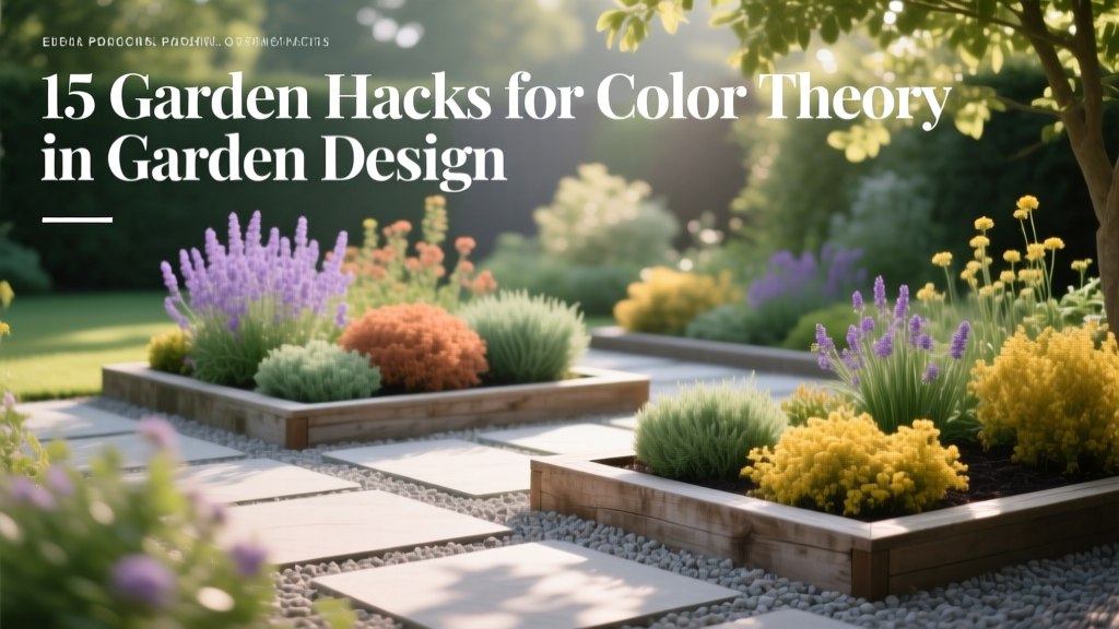
15 Garden Hacks for Color Theory in Garden Design
The most common “why does my garden look messy?” mistake isn’t plant choice—it’s using too many equally loud colors at the same volume. When every bloom is trying to be the star, your eye has nowhere to rest, so even expensive plants can read as chaotic instead of intentional.
The good news: you don’t need an art degree to make color theory work outdoors. You just need a few repeatable shortcuts that help you control hue, value (light/dark), and saturation (intensity) the way designers do—without sketching 30 versions on graph paper.
Start with a Color Plan You Can Actually Stick To
1) Pick a “60-30-10” Color Ratio (and Write It Down)
Use one main color family for about 60% of what you see, a supporting family for 30%, and a small accent for 10%. This stops the “rainbow explosion” effect and keeps shopping decisions simple when you’re staring at too many tempting flats. Example: 60% green + white, 30% purple/blue, 10% chartreuse or hot pink accents.
2) Build from Foliage First, Flowers Second
Flowers come and go; leaves stick around for months, so let foliage carry your palette. Aim for at least 70% of your visible color to be foliage and structure, then let blooms be seasonal highlights. Example: a backbone of boxwood or yew + heuchera + ornamental grasses gives you a steady canvas; then you rotate in tulips, zinnias, or mums as the “pop.”
3) Use the “Three-Plant Rule” to Keep Color Repeating
Any color you introduce should show up at least three times in the garden to read as intentional. That can be three clumps of the same plant, three containers, or three different plants that share the same hue family. Example: repeat burgundy three ways—Heuchera ‘Obsidian,’ a burgundy coleus, and a dark-leaf dahlia.
4) Snap a Black-and-White Photo to Diagnose Value Problems
If your garden looks flat or chaotic, it’s often a value issue (too many similar mid-tones), not a “wrong color” issue. Take a quick phone photo and apply a black-and-white filter: you’ll immediately see if everything is the same gray. Fix by adding either very dark foliage (near-black) or very light elements (silver leaves, white blooms, pale gravel) to create contrast.
Shortcut Color Schemes That Almost Always Work
5) Go Monochrome—But Vary Texture and Bloom Shape
Monochrome beds look designer-level fast, but only if you vary form so it doesn’t feel like a flat carpet. Mix at least 3 textures (spiky, mounded, airy) and 2 bloom sizes within the same color family. Example: an all-purple border using salvia (spikes), allium (globes), and verbena bonariensis (airy) reads rich, not repetitive.
6) Use Analogous Colors for “Calm” Areas You See Daily
Analogous colors sit next to each other on the color wheel (blue-violet-purple, or yellow-yellow-orange). They blend easily, which is perfect for entry paths, patios, and the view from a kitchen sink—places your eye lands every day. Example: blue nepeta, violet salvia, and purple coneflower make a long-blooming, low-drama mix.
7) Save Complementary Colors for Small, Controlled Punch
Complementary pairs (purple/yellow, blue/orange, red/green) are high contrast and can look amazing—or like a sports logo—if overused. Keep them to the “10% accent” role or isolate them in one bed. Example: a contained purple-and-gold container combo (purple petunias + gold sweet potato vine) looks intentional; scattering purple and yellow randomly across five beds often reads noisy.
8) Use White as a “Color Eraser” Between Clashing Tones
White blooms and silver foliage act like a visual buffer when two colors fight. A simple hack is to insert a 12–18 inch band of white/silver between hot colors (like red and magenta) that can clash in natural light. Example: a strip of dusty miller or white alyssum between red geraniums and pink calibrachoa makes the transition feel planned.
Scale, Distance, and Light: The Stuff Most People Miss
9) Match Color Saturation to Viewing Distance
Bold, saturated colors read best from far away; subtle pastels disappear unless you’re close. If a bed is viewed from 20–40 feet away (street, across the lawn), prioritize stronger colors and larger flower clusters. Example: from the curb, bright zinnias and rudbeckia show up; pale blush roses often look like “green with dots” unless you’re within 6–10 feet.
10) Use Warm Colors to “Pull” Areas Forward, Cool Colors to “Push” Them Back
Warm hues (red, orange, yellow) visually advance, while cool hues (blue, violet) recede—an old designer trick that works in landscapes too. Put warm colors near the front of a border or close to a patio if you want energy; place cool colors toward the back to create depth. Example: in a 10-foot-deep bed, plant orange marigolds at the front 2 feet and blue salvias at the back 2 feet to make the bed feel deeper.
11) Plan for Morning vs Afternoon Sun—Color Shifts Are Real
Harsh afternoon light can “wash out” pale colors and make bright colors feel neon. If a bed gets strong 2–6 p.m. sun, lean into saturated colors and darker foliage; reserve soft pastels for east-facing or dappled-shade spots. Real-world example: pale lavender flowers that look romantic at 9 a.m. can look nearly white at 4 p.m. in full sun, losing the color effect you paid for.
12) Use Dark Backgrounds to Make Bright Blooms Pop (Cheaply)
Contrast is your secret weapon: bright blooms pop harder against dark hedges, fences, or even a painted wall. If you don’t have a hedge, paint a fence a deep charcoal or black—often $35–$60 per gallon, and a single gallon can cover roughly 250–350 sq ft depending on texture. Example: a black-painted fence behind peach roses makes the blooms look more saturated without changing a single plant.
“Color effects are strongly influenced by light intensity and background; the same flower can appear dramatically different depending on exposure and contrast.” — Royal Horticultural Society (RHS) guidance on garden color planning (2020)
Planting Layout Hacks That Make Color Look Intentional
13) Plant in Odd-Number Drifts (3, 5, or 7) for Instant Cohesion
Odd numbers look more natural and less like “one of everything” lined up. For medium perennials, a drift of 3 plants spaced 12–18 inches apart usually reads as one confident statement instead of scattered dots. Example: three lavender plants in a triangle look like a design choice; two look like leftovers.
14) Use a “Gradient Border” to Transition Between Strong Colors
If you love multiple bold colors, don’t abandon them—blend them. Create a gradient by stepping through related tones: magenta → pink → blush → white, or yellow → apricot → orange → rust. Example: in a 12-foot border, assign roughly 3 feet per color step so your eye travels smoothly rather than hitting a hard stop.
15) Borrow This Pro Trick: Repeat One Neutral Hardscape Color Everywhere
Hardscape color counts as part of your palette, and repeating it ties everything together—even if your plants change. Choose one neutral (charcoal, warm gray, buff) for edging, pots, or gravel, and repeat it at least 3 times across the yard. Example: three charcoal containers on a patio + a charcoal stepping stone path can make mixed flower colors look coordinated instead of random.
Money-Saving DIY Tools for Color Planning
DIY Hack: Make a “Color Swatch Walk” with Paint Chips
Grab 6–10 paint chips (free) in your target palette and take them outside at the time you’ll most often view the garden (try 9 a.m. and 5 p.m.). Hold chips next to existing blooms and foliage to see what truly matches in natural light. Example: what looks like “true purple” indoors often reads blue outdoors; paint chips save you from buying the wrong-toned annuals.
DIY Hack: Use One $5 Pack of Index Cards as Color Labels
Write your 60-30-10 palette on index cards and tape one to your potting bench, one inside a shed door, and one in your phone case. This sounds silly, but it stops impulse buys that derail your scheme. Example: if your accent color is “hot coral,” you’ll think twice before grabbing a flat of bright red begonias that will fight the plan.
Real-World Scenarios (So You Can Picture It Working)
Scenario 1: The Tiny Front Bed That Always Looks Busy
A 4 ft x 8 ft foundation bed can’t handle eight different bloom colors; it reads like visual clutter from the sidewalk. Use a simple analogous scheme: blue + violet + white, and repeat each color at least three times. Example plant mix: 3 nepeta, 3 purple salvias, and a front edge of white alyssum—clean, calming, and it photographs well.
Scenario 2: The Rental Yard Where You Can’t Dig Much
Containers are perfect for color theory because you can control the palette and move pieces around like living paint samples. Do three containers in the same pot color (charcoal or terracotta) and stick to one complementary pairing for punch (purple + yellow), keeping the rest neutral. Cost hack: instead of buying three matching ceramic pots at $40 each, buy three identical resin pots at $12–$18 each and spend the savings on better soil.
Scenario 3: The Long Side-Yard Path That Feels Like a Tunnel
Side yards often feel narrow and gloomy, especially with fences. Use cool colors (blue, white) and silver foliage to brighten, and keep warm accents minimal so they don’t visually “close in” the space. Example: a repeating ribbon of white hydrangea (or white impatiens in shade) with silver lamium at the edge can make a 3–4 foot wide strip feel more open.
A Quick Comparison Table: Two Easy Ways to Fix a Chaotic Color Bed
| Fix Method | Best For | Time Needed | Typical Cost | What You Actually Do |
|---|---|---|---|---|
| “White Buffer” Band | Clashing colors you still want to keep | 1–2 hours | $10–$35 | Add a 12–18 inch strip of white/silver plants (alyssum, dusty miller, lamb’s ear) between the loud sections. |
| “60-30-10 Reset” | Too many colors, no clear theme | 2–4 hours | $0–$80 | Keep your main 1–2 colors, move or remove outliers, and limit future buys to the written palette; swap extras into pots or the backyard. |
Color Choices That Also Help Pollinators (Without Wrecking Your Palette)
If you’re trying to balance beauty with bees, it helps to know pollinators respond to flower color and pattern. University extension resources regularly note that many bees are especially attracted to blue, purple, violet, white, and yellow blooms (Penn State Extension, 2019). That’s great news for color theory, because those hues also build calm, cohesive schemes.
Another handy lens: UV patterns and nectar guides exist on many flowers even when humans see a “simple” color, which helps pollinators locate nectar efficiently (USDA Forest Service pollinator resources, 2020). Practically speaking, you can stick to a tight palette and still plant a buffet—as long as you repeat those colors and provide long bloom windows.
Bonus Hack: Time Your Color “Waves” So Something Is Always Carrying the Scheme
Instead of mixing every season into one bed, plan 2–3 color waves. Example timing: spring (April–May) bulbs in your main color, summer (June–August) perennials in the supporting color, and fall (September–October) annuals or mums in your accent. This keeps the palette consistent across the year without needing constant replanting.
If you try just one thing this week, do the black-and-white photo test and pick a 60-30-10 palette from what you already own. Once you see value and repetition working together, you’ll stop buying random “pretty” plants—and start building beds that look designed on purpose.
Sources: Royal Horticultural Society (RHS) color planning guidance (2020); Penn State Extension pollinator-friendly plant color guidance (2019); USDA Forest Service pollinator resources (2020).