5 Garden Hacks for Texture Combination in Borders
The most common border mistake isn’t “wrong plant,” it’s “all the same texture.” A bed full of mid-sized, medium-texture plants can look oddly flat—even when the color palette is perfect—because your eye has nothing to grab onto. Texture is the cheat code: get texture contrast right and a border looks designed on purpose, even if you’re mixing clearance perennials with hand-me-down shrubs.
Texture isn’t just “leaf shape.” It’s leaf size, stiffness, shine, density, and how a plant moves in wind. The hacks below are built for real gardens (including messy ones), with measurements and quick rules you can actually use while standing in the driveway holding a nursery pot.
Fast Layout Rules (So Your Border Doesn’t Turn Into Texture Soup)
Hack 1: Use the “1 Bold : 3 Medium : 5 Fine” ratio (then repeat it)
Headline: Build texture rhythm with a simple planting ratio that works in small and large borders.
For every 1 bold-textured plant (big leaves, chunky shape), aim for 3 medium and 5 fine-textured plants. It sounds arbitrary, but it prevents the two biggest failures: too many “attention hogs” or a sea of sameness. Think of it as a repeating beat—your eye can relax because it knows what to expect.
Real-world example: In an 18-foot border, you might repeat this combo twice: 2 bold anchors (like Rodgersia or a compact hydrangea), 6 medium fillers (salvias, daylilies), and 10 fine plants (ornamental grasses, threadleaf coreopsis). If you’re counting individual plants feels fussy, count clumps instead.
This also lines up nicely with how we perceive complexity: you want contrast, but not chaos. If you’re designing for low effort, this ratio keeps you from “over-buying the weird stuff” that later feels impossible to place.
Hack 2: Set a “texture viewing distance” using the 10-foot test
Headline: Texture needs to read from where you actually stand, not where you wish people would stand.
Most borders are viewed from 6–15 feet away (driveway, patio, sidewalk). From 10 feet, fine textures blur into a soft mass, while bold textures still read as individual shapes. Before you plant, place pots on the ground, walk back 10 feet, and check: can you identify at least two distinct textures without squinting?
Real-world example: A homeowner border along a front walk looked “busy” up close but boring from the street. Swapping two medium-texture perennials for one bold clump of Ligularia dentata (big, round leaves) fixed the street view instantly—same colors, just stronger texture contrast.
If your border is only seen from a window across the room (say 20–30 feet), you’ll need bigger texture moves: larger leaves, thicker grass clumps, or strong structural plants.
5 Practical Texture Hacks (Built for Real-Life Planting)
Hack 3: “One Big Leaf Per 4 Feet” anchor rule (bold texture without overdoing it)
Headline: Add bold texture at a predictable spacing so it feels intentional, not random.
A simple anchor rule: include one bold-texture plant every 3–5 feet along the border’s length (4 feet is a sweet spot for most home gardens). Bold texture includes big-leaf perennials (hosta, ligularia), broad-leaf shrubs (hydrangea), or architectural plants (phormium in mild climates). This spacing keeps bold leaves from clumping into a heavy blob while still giving your eye a steady “rest stop.”
Real-world example: In a 12-foot shady bed, use 3 bold anchors: a large hosta at each end and one in the center. Between them, weave medium textures (heuchera, astilbe) and fine textures (Japanese forest grass). The bed suddenly looks layered—even before flowers show up.
Money-saving note: If bold anchor plants cost $18–$35 each at the nursery, you can cheat with division. Many hostas and daylilies can be divided into 2–4 pieces in early spring or early fall, giving you multiple bold clumps for basically free.
“Massing plants rather than scattering individuals improves visual impact and reduces maintenance.” — University of Illinois Extension (2021)
That “massing” advice isn’t just about color; it’s texture, too. A bold leaf reads best in a clump or repeated rhythm, not as a lonely single plant that gets visually lost.
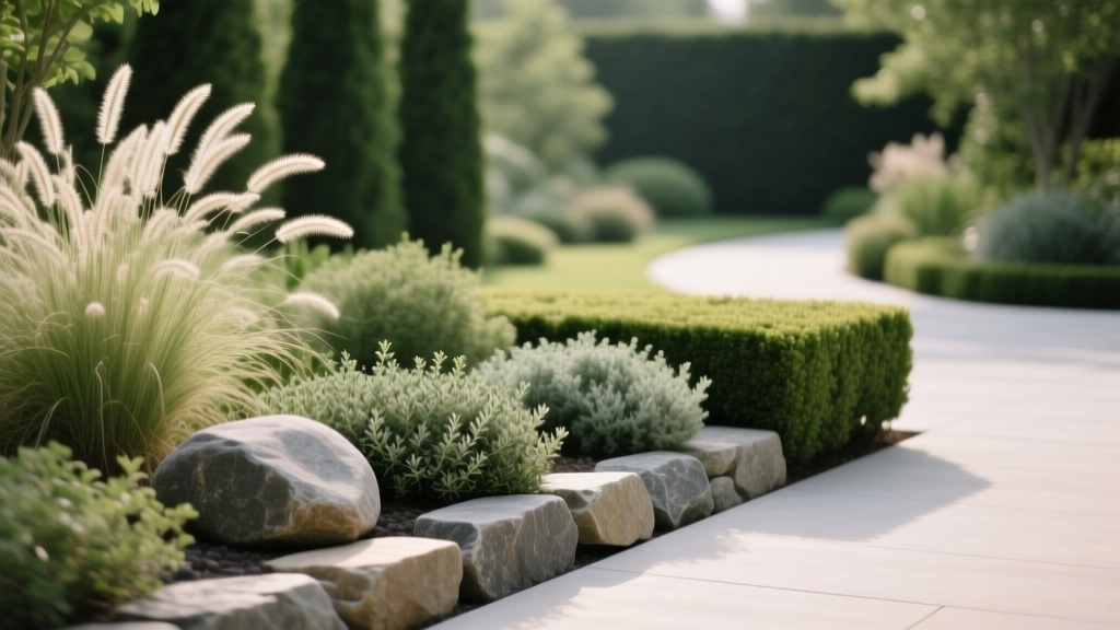
Hack 4: Pair opposites on purpose: use the “stiff + soft” and “shiny + matte” combo list
Headline: Stop guessing and start using proven contrast pairings that read from a distance.
Texture contrast is easiest when you pick opposites: stiff vs. soft, shiny vs. matte, large vs. small leaf, dense vs. airy. Choose one contrast lane and repeat it 2–3 times in the border so it feels coherent. This is the shortcut designers use to make mixed plantings look “pulled together.”
Real-world example: Stiff + soft: upright iris leaves next to feathery yarrow. Shiny + matte: glossy bergenia beside matte lamb’s ear. Dense + airy: boxwood or a compact hydrangea with gaura or verbena bonariensis floating through it.
| Texture pairing method | What it looks like | Best for | Common mistake | Fix |
|---|---|---|---|---|
| Stiff + soft | Strong structure with a “cushion” beside it | Front-yard borders, modern styles | Too much stiff = harsh | Add 1–2 soft fillers per stiff plant |
| Shiny + matte | Subtle contrast that reads close-up | Patio borders, shade gardens | Only works up close | Also include a bold leaf for distance |
| Large + fine leaf | Instant “designer” layering | Any border you want to look deeper | Fine textures disappear at 15+ ft | Mass fine textures in clumps of 3+ |
DIY alternative: If you don’t want to buy new plants, fake the “soft” layer by tucking in a seasonal filler like annual sweet alyssum or dwarf fountain grass. A single $4–$6 annual can soften the base of a stiff plant all season.
Hack 5: Add a “texture edge” strip: 12–18 inches of fine texture along the front
Headline: Create an instant finished look by controlling the border’s front edge texture.
If the front edge of a border is random, the whole border feels messy. Here’s the trick: run a consistent 12–18 inch strip of fine texture along the front—something mounding and small-leaved—then let bigger textures rise behind it. This creates a clean visual “hem,” like a tailored edge on clothing.
Real-world example: Along a driveway border, use thyme, low sedum, or creeping Jenny (watch spread) in a continuous band. Behind that, plant medium perennials (salvia, coneflower), and then your bold anchors (hydrangea, tall ornamental grasses). Even if you miss a week of weeding, the border still looks intentional.
Timing tip: Install the edge band in early spring when soil is workable, or in early fall about 6–8 weeks before your average first frost so roots settle in. Many extension services recommend fall as an excellent establishment window for perennials because soil stays warm while air cools, reducing stress (Iowa State University Extension, 2019).
Cost hack: A fine-texture edge can be the cheapest part of the border if you choose fast spreaders you can divide later. One flat of small groundcovers might run $35–$60, but starting with 6–10 plants and spacing them 12 inches apart can fill in within a season or two, depending on species and watering.
Problem-Solving Scenarios (Because Gardens Don’t Behave Like Diagrams)
Scenario 1: The narrow side-yard border (2 feet wide) that always looks cramped
In a 24-inch-wide strip, texture contrast has to be vertical, not sprawling. Use one narrow upright texture (like feather reed grass ‘Karl Foerster’), one bold clump (hosta or bergenia), and then a fine front edge (thyme or carex) so the border reads layered without physically taking up more width.
A practical spacing: set upright plants about 24–30 inches apart, bold anchors about 36 inches apart, and keep the fine edge continuous. This keeps the planting from turning into a wall of leaves that catches every fallen leaf and piece of litter.
Scenario 2: The sunny mixed border that’s “pretty” in bloom but bland the rest of the year
This is usually a texture problem, not a flower problem. Add at least one evergreen or semi-evergreen texture (like lavender, santolina, or a small conifer) every 6–8 feet so the border has winter bones. Then add fine-texture grasses in clumps of 3 so your eye still sees movement and lightness even when flowers are gone.
Example planting move: If your bed is mostly coneflowers and black-eyed Susans (medium texture), drop in a bold clump like hardy hibiscus (big leaves) or a shrub like ninebark (coarser texture), then stitch the gaps with fine texture like blue fescue or prairie dropseed.
Scenario 3: The shady border under trees where everything looks “muddy” by mid-summer
Shade borders often end up with too many similar matte, medium leaves. You can fix that without adding flowers by mixing leaf finishes and sizes: pair bold hosta with fine Japanese forest grass, then add a shiny leaf (like certain hellebores or glossy-leaf epimediums) to break up the matte look.
Maintenance shortcut: Under trees, texture clarity disappears when plants are stressed. A 2–3 inch mulch layer can stabilize soil moisture and reduce competition. Research-based guidance commonly recommends keeping mulch pulled back from stems and trunks to avoid rot (USDA Forest Service, 2020).
Extra Tricks That Make These Hacks Stick
Use “texture repeats” like you use color repeats (but fewer is better)
Pick 2–3 texture signatures and repeat them across the border: maybe bold leaves (hosta/hydrangea), fine movement (grasses), and a spiky vertical (iris/allium). Repeats are what make a border look designed instead of collected. If you add a fourth signature, make it small—like a shiny leaf accent near seating where it’ll be noticed up close.
Example: Repeat the same ornamental grass cultivar in 3 clumps instead of buying three different grasses. You’ll spend about the same, but the border will look calmer and more intentional.
Photograph in black-and-white to catch texture problems fast
This is a sneaky trick: take a photo and switch it to black-and-white. Without color, texture and massing become obvious—especially “all medium texture” areas that need a bold anchor or a fine edge. Do this from 10 feet away (remember the viewing-distance hack), and you’ll see exactly where the border falls flat.
DIY alternative: If you don’t want to mess with camera settings, squint at the border. Squinting reduces detail and color, leaving you with a quick read on mass and texture contrast.
Plan for mature texture size, not pot size (and use a measuring tape once)
Texture combinations fail when big leaves mature and swallow fine textures. Before planting, look up mature spread and mark circles with a hose or flour. Even doing this once—just for your bold anchors—prevents the classic mistake of planting fine textures too close, then losing them by year two.
Specific rule: Give bold plants a “breathing ring” of about 6–12 inches of open space around the mature outline, then fill that ring with fine texture that can tolerate being edged back (like creeping thyme or small sedges). It keeps the bold shape readable instead of turning into a tangled mash.
Save money by using “temporary texture” while plants fill in
New borders look sparse, so people overbuy fillers and regret it later. Instead, use temporary texture for one season: annual grasses, coleus (amazing leaf texture), or even potted herbs like rosemary (where hardy). A few $5 annuals can carry the look while perennials bulk up, and you won’t be ripping out expensive plants next year.
Example: If your new hydrangeas are still small, place two pots of fountain grass between them for the season. When the shrubs size up, you can move the pots to another bed or compost the grasses—no long-term crowding.
The fun part about texture is you can fix it without ripping everything out. Add a bold anchor, mass a fine texture in clumps of three, and tidy the border’s front edge into a consistent strip. Those three moves alone can make an “okay” planting look like it had a designer on speed dial—without the designer price tag.